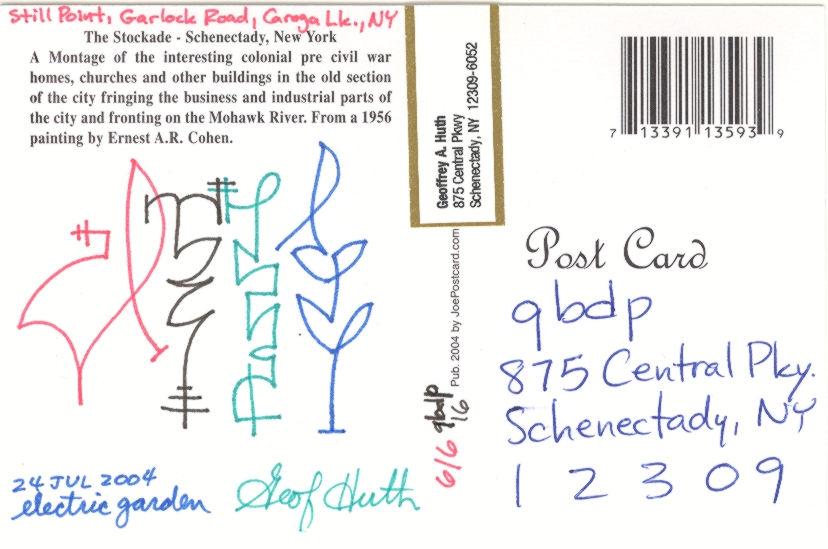
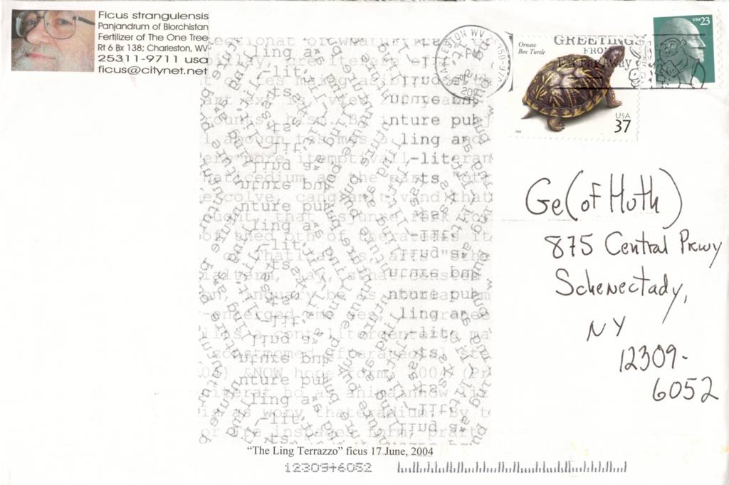
Still Point, Garlock Road, Caroga Lake, New York
Since I've been on East Caroga Lake for more than a day, I should not have received any mail today. But my daughter Erin had to go to into Schenectady today, so she could sell bread at the bakery where she works, and she also retrieved our mail. There was so much mail that it didn't fit in our mailbox, and two of the items were, for my purposes today, mailart.
Arenellanism # 277
Roy Arenella writes me a letter, dated 30 June 2004 and addressing me as "Ge0f" as he is wont to do--the zero signifying, hmm, something positive, maybe signifying the way symbols can be used visually to represent what they really are not.
The letter discusses how my "sustained close attention
and response" to his mailings via my blog are offsetting his usual rhythms. His purpose is not to complain and he does not, but he wonders about all of this. As do I. Roy surprises me with each of his mailings, each suggests meaning can reside almost everywhere, and each corner of meaning resonates against the last and the upcoming. And I love giving attention to small pieces of writing and art. That is, essentially, the focus of much of my life. But I stay up later at night now, thinking and writing and editing, and I'm wondering how to achieve my own results more quickly so I can get to bed earlier. Something to ponder.
This mailing--# 277--is a favorite, because it gains me extra insight into the mind over at the Arenellaworks. Roy provides me with a little explanation of philately. I didn't think I needed any. I mean, I know what a tête-bêche is, and often use philatelically inspired ideas in my work. But Roy introduces me to
maximaphily, something I'd never heard of before. In maximaphily, philatelists match a commemorative stamp with a postcard that echoes that stamp and then with a postmark that reechoes it all. This, of course, is a good enough description of what Roy does with his mailart.
Enclosed in the envelope are three examples of works resembling maximaphily:
1. Two views of Liberty Island and the Statue of Liberty from the open water--sitting above a 22-cent (statue of) Liberty stamp, and cancellations from Liberty Island itself and from Paris.
2. A newspaper clipping from the New York
Journal American, 1 Aug 1954, showing Roy Arenella himself, aged 15, feeding a sparrow hawk from his own mouth--above a first-day-of-issue postmark from Aurora, Colorado, and 1-cent sparrow hawk stamp.
3. And the best, which Roy sends me as a real photograph: a photo of a crowd (at the first-day-of-issue celebrations for a 34-cent Rockwell Kent stamp). The crowd is in the background, out of focus and rising up from the open pages of
Moby Dick, the recto page of which includes Kent's famous illustration of a whale's giant tail flipping a rowboat of sailors and their boat up out of the water and upside-down. On that same page of the book, partially obscuring the illustration, rests a copy of the aforesaid 34-cent stamp. Best yet, atop the photograph, partially obscuring the image in the photograph, is laid down an actual exemplar of this real-life stamp, which is cancelled with a first day of issue 1 Feb 2001, New York, NY, 10199. This is copy 1 of 3, and it's a treasure.
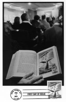
Roy Arenella, Rockwell Kent First Day of Issue (2001)
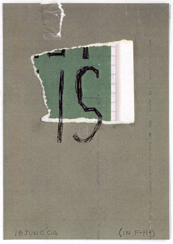
Arenellanism # 278
This is a simple card, dated 1 July 2004, where he explains that his
concrete poem typed into lead was meant to be unscannable, a joke to keep my blog from documenting the poem. On the front of the card is a photograph of "One-Way Door, Chelsea, 4/7/'04." Atop the door runs a set of decorative arches, which the stamp of the Peace Bridge on the other side of the card somehow mimics. Oh, and the pseudo-cancellation stamp includes a rubberstamping of a man eating a hat--another Huth pun! Boundless.
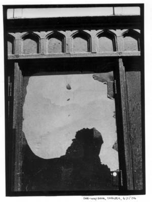
Roy Arenella, "One-Way Door" (7 Apr 2004)
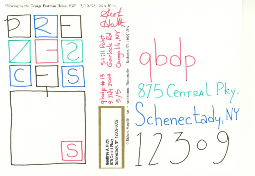
PRESENCES
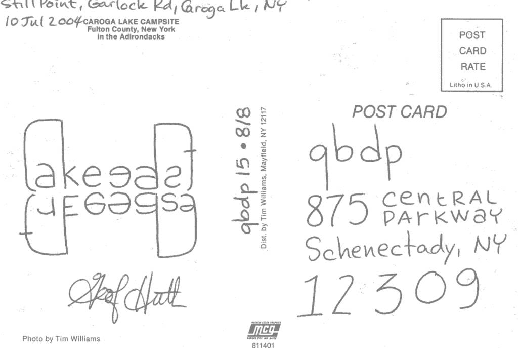
I wrew a little visual poem (a fidgetglyph) out of 11 squares and ten letters. Each fidgetglyph appears on a different postcards of
Richard Margolis' "Driving by the George Eastman House" series of photographs. (Last October, I chaired a panel that discussed archives and art and how they worked together. Richard was a panelist that day. I found his architectural photographs interesting, but his images of the George Eastman House through his windshield were the most captivating of all.)
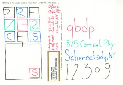
Geof Huth, "PRESENCES" (2004)
These are the recipients of "PRESENCES":
1/5 Ruth and Marvin Sackner
2/5 Bob Grumman
3/5 Roy Arenella
4/5 Tim Canny
5/5 qbdp
un violon d'ingres

.1.jpg)


.jpg)
.jpg)