Friday, January 28, 2005

Second Card from the Fluxus Heidelberg Center

Ruud Janssen sent me a second card while he was at the Fluxus Heidelberg Center this month. This card included a small illustration, putatively of four famous mailartists together as infants.


Ruggero Maggi,
"The Networking Children Saga is Continuing" (2004?)

un violon d'ingres

A Drawing Forth

The enigmatic Bob Brueckl has created another of his dark drawings. He likes to work with black ink, creating drawings that flash on and off, black and white. This drawing he has created in such a way that islands of paper also bubble up out of the blackened areas of the page, which the reader should be able to make this out in the grayscale version of the drawing I am presenting here.


Bob Brueckl, Drawing (18 Jan 2005)

Drawn on a deckle-edged piece of pulpy grey paper, this drawing is backed with a simple note: "To Geof Huth from Bob Brueckl 1-17-05." The seven is crossed in the European manner, but the 1 is fully American.

un violon d'ingres

The Vernacular Architecture of the Arenellan Postcard

In the mail, I received a brown card from Roy Arenella, but it is a striking brown card.

The postcard is from the Restaurant Florent on 69 Gansevoort in New York City, where I've never eaten, though maybe I should. Among the words and clip art on the front of the card, Roy has inserted a bit of advice for me: DONT FORGET / TO / PRAISE / (AS A / (RE)SOURCE) / THE / VERNACULAR! / IN / VISPO. This note makes me wonder exactly what I could say about the use of the vernacular in visual poetry. Roy knows much about visual poetry that I don't, so he probably has something in particular in mind.


Roy Arenella, "DONT FORGET" (13 Jan 2005)

Usually, I show only one side of a card, but the backside of this card of Roy's is too good to leave hidden. He has glued a matchbook (slightly askew) to the card, and written my address on the matchbook. One of the stamps on the card, appropriately, commemorates folk art (or vernacular art). This is card numbered 21C, meaning it is the 21st mailing of the year and is a card.


Roy Arenella, Reverse of "DONT FORGET" (13 Jan 2005)

un violon d'ingres

The Vlope and the Rainbows

Fike sent me another package of mailart. I liked this envelope (with the flapper photo and the butterfly + art rubberstamping) and the "Rainbow Skin" card, so I decided to present these to the public. Fike's note mentions that he's pining for warmer weather, but I wonder if he's experienced weeks of temperatures in the negatives as we're getting here in Schenectady. (It is negative 3 degrees Fahrenheit here as I write this.)

Fike's note also includes a list of recent mailart showing that he (astoundingly enough) received two bits of mail from Schenectady on the same day: one from me and one from Alan Catlin, a poet who lives a couple of blocks from me--but whom I've never met, though we have written each other. Years ago, Alan explained that he worked nights, which kept us from meeting, but Fike's list of mailart includes an entry listing Alan's retirement from his tavern work.


Ficus strangulensis,
Envelope and "Rainbow Skin" (12 & 7 Jan 2005)

un violon d'ingres

News of "Wordnews"

While Ruud Janssen was toiling away at the Fluxus Heidelberg Center earlier this month, he took the time to send me this postcard documenting "WORDNEWS," which appears to be an interesting piece of information art. But I thought I'd show this side of the card instead of the front, especially since the back includes the card's mailart number ("05-005," the fifth card of the fifth year of the century). The number 5 is of particularly significance in my personal "numerology," making this card a wonderful gift.


Ruud Janssen, Card # 05-005 (Jan 2005)

un violon d'ingres

Monday, January 17, 2005

The First Klediment: "quincelt" (qbdp # 42)

The opening of Roy Arenella's last letter to me convinced me to make a simple card for the beginning of the year. His message?

Usually I like the unfinished or more ephemeral appeal of things but I do like the year-end "complete package" feeeling of the last qbdp (#41) of 2004.

...

But I like just as well the simpler, more off-hand feeling of things like the ballpoint-drawn glyphs on plain cardboard stock. "Work with what you've got where you are" would be a good Visualist motto.

Somehow, this note reminded me of the existence of my never-published proto-fidgetglyphs, Klediments Grandma Quilted out of the Things of Her House, each klediment of which takes the word "quilt" and wraws another word into it. I wrote these back in the 1980s, and they never caught anyone's imagination (besides, apparently mine). So I bring them back now because I think my little mailart cards are often too simple, but Roy does not necessarily believe so.

The unsuspecting recipients of "quincelt" (qbdp # 42) are as follows:

1/10 Ruth and Marvin Sackner

2/10 Bob Grumman

3/10 Roy Arenella

4/10 kiyotei

5/10 Scott McDonald

6/10 Mick Boyle

7/10 j0llyr0ger

8/10 Jassy Lupa

9/10 Bob Brueckl

10/10 qbdp

For anyone missing out on this ancient fidgetglyph, have no fear. I'll probably release others into the world later this year. A klediment, after all, is a regional term for "something treasured."

un violon d'ingres

geometric email postcard art design card

Mick Boyle continues to experience problems with his printer, so he sends me his cards electronically, both the front


Mick Boyle, Obverse of "The Geometry of Huth" (15 Jan 2005)

and the back


Mick Boyle, Reverse of "The Geometry of Huth" (15 Jan 2005)

I loved the geofhuthqbdp design so much that I have incorporated it as the logo for this site (as opposed to the logo for me, which is currently a postage stamp with the name "HUTH" perforated into it). Another great card from Mick Boyle, who doesn't fail to surprise and delight.

un violon d'ingres

Not an Iota of an Idea of Nota in Geof

In this most recent mailing of Roy Arenella's, he writes, "Sometimes I can't believe how slow I am--in things that should be important to me." Well, he is not alone.

Late last year, Roy sent me a couple of versions of a little visual poem he was working on. Somehow, I could recognize the letters in the poem, yet I could not see the obvious word they spelled out! (which is "iNotA" to me and "NOTA" to Roy. Take a look at this version he included in the current mailing:


Roy Arenella, "iNotA" (7 Jan 2005)

The piece is only better, now that I can read it! But, boy, is this embarrassing. It's amazing how long a mind sometimes needs to perceive the obvious.

In this package from Roy, he also included a few Samurai Global Co mini-notebooks (thanks for those!), which "visual writers love to love," a meaty letter (which reminds me I need to write a bit about Japanese visual poetry), and a little gift of visual writing for me:


Roy Arenella, "Radio g" (21 Dec 2004)

This mailing from Roy is # 18L+E (the eighteenth mailing, consisting of a letter and enclosures).

un violon d'ingres

Continuing "Continuing Signs"

Roy Arenella's first piece of mailart to me for the year is also the first piece of mailart he released into the wilds of the postal system this year. I am honored.

This big and beautiful card is part of his series "Continuing Signs," which captures interesting textual signs in their native environments, focuses our attention on them, and shows the discontinuities in their messages. This time, we have an image emblazoned with the word "IMAGERY" over a few scraggly texts taped to a wall. Roy has seen fit to entitle this piece (nearly 20 years old now) "Word."


Roy Arenella, "WORD" (1986)

The card is number 1 CXP/C (which means it is the first mailing of the year and also a color xerox photocard). Along with a few other notes, Roy includes this interesting background on his photograph:

The photo was taken in the lobby of what is generaly known here as a "welfare hotel". What is not known, generally, is that the poet James Schuyler in 1978 was forced by personal contingencies to live there--a place where the ambiance is not conducive to writing good poetry.
un violon d'ingres

White Crows on Mottled Grass

Scott McDonald has sent me a little new year's greeting postcard. He likes to work with negative color images, so he has taken a picture of a couple of blackbirds of some kind and added their voice to the image: a single caw for a few birds.


Scott McDonald, "c a w" (5 Jan 2005)

un violon d'ingres

Owltree Winter

Mick Boyle's mind for design is inexhaustible. Here he presents the beautiful gift of a black owl in a black tree against a grey world. The unseen (to you) reverse of the card includes lots of spare yet beautiful design elements as well--including a little lozenge of space set aside for a message but left empty.


Mick Boyle, [Hollow-eyed Owl in Black Tree] (5 Jan 2005)

un violon d'ingres

Stencilled Mouth

This is my second card from Bob Brueckl created upon a blank piece of 140-pound Strathmore watercolor card, a mailart medium I sometimes use as well. Again, I'm still working on the interpretation of this card, not knowing Bob makes it a bit harder. The image itself on the obverse of the card


Bob Brueckl, "MOUTH PiECE" (4 Jan 2005)

suggests a pun: not just a mouthpiece used to make sound with a wind instrument, but also some piece (written or said) that uses or suggests words and sounds. On the reverse of the card, Bob has inscribed this message (once again with letter stencils):

HUTH
MOUTH:
VILE OR
PRECIOUS
?
TRUTH

Remarkably, it appears that Brueckl knows how to pronounce my name: "Huth" rhymes with "Truth." But what to make of the message itself? Is he referring to my occasional discussions of the orality of visual poetry? Is he referring to my writings on visual poetry in general?

The mystery continues.

un violon d'ingres

The Desert, a Dessert for the Eyes

I am originally from California, specifically from the peninsula that holds San Francisco at its tip, and I've lived all over the country, so I understand the differences among the regions of the country, yet I still find myself surprised by the initial foreignness of the vocabulary accompanying this delicate postcard drawing by kiyotei:


kiyotei, "Anza Borrego Flash Flood" (30 Dec 2004)

I had to look up "Anza Borrego" to discover that this is the name of a state park in my home state, and the title atop this piece tells us we are viewing a flash flood through that park. But below the drawing, we have three words: ocotillo, aqua, nopal. These words clearly identify the parts of the image for us, from left to right. The ocotillo is a desert shrub with slender branches that burst into clusters of red flowers in the rainy season, aqua is water, and the nopal is simply the prickly pear cactus.

Here we have a simple landscape: The red efflorescence of the ocotillo, the reddish brown of the water rushing through the desert, the red spines (are they ever really red?) and spine-nombrils of the nopal.

un violon d'ingres

Sunday, January 16, 2005

Four Portraits, Four Media

Jassy Lupa sent me, on the last day of last year, a thin card upon with the dark face of a man is printed (portrait 1). But I like the other side better, since it comes with a colorful self-portrait of Lupa (# 2) painted and penned to the reverse of the postcard, a hand-carved rubberstamping of a man's face in purple (# 3), and a stamp with a profile of our first president, George Washington (# 4).


Jassy Lupa, Card and Self-Portrait (31 Dec 2004)

un violon d'ingres

Thursday, January 13, 2005

Fikeland

Here's a little peek at a typical mailart mailing from Ficus strangulensis. Notice that it's filled with items. This time, they are primarily artist trading cards. But Fike always sends a note as well. In this case, he commiserates with me about my recent burst pipes (now both of which are fixed) and asked me what "GNET" means on my eXmaSscard to him (well, Geof, Nancy, Erin, and Tim Huth).


Ficus strangulensis,
The contents of a standard mailing (31 Dec 2004)

un violon d'ingres

A Message from Brooks

I do find myself a bit perplexed by this card from Carroll Brooks. I decided not to show the entire card back or front because it was a simple notice for a blues fest at an art gallery--and not obviously related to the sender. Instead, I focus our attention on the brief note of encouragement. Minimalist mailart? Regardless, a little praise I am thankful for.

On the front of the card, Brooks includes an address sticker identifying himself as a student of the "Dumpster School of Art" of Peoria, Illinois. The label also includes a zip code--but no street address or post office box number, so I've no idea if mail to this address will work!


C. Brooks, "Keep up the..." (30 Dec 2004)

un violon d'ingres

Picture from Brueckl

I received on the same Monday, January third, a second piece of mail from Bob Brueckl--this one a postcard with this dramatic black and white drawing. On the back of the card (the message side), Bob has include this message, outlined with a stencil lettering set:

CORK-
SCREW
PENIS
NOEL


An interesting end-of-the-year greeting, to say the least!


Brueckl, "Corkscrew" (20 Dec 2004)

un violon d'ingres

First Day of Football Heroes Cover

So I'm still talking about mailart that came to me on the first day of mail for 2005--that is, a week ago Monday.

I received two pieces of mail. One was this first day cover, an expensive little fancy piece of philately that Bob Brueckl has intentionally undermined the point of by mailing it to me after the first day of the stamp's issue.

This reminds me of a story I once told Roy Arenella: When I was a young boy living in Barbados, I was a big stamp collector and once bought a first day cover to gain a stamp I wanted. Then I went home and soaked the stamp off the cover.

Ah, wasted youth!


Brueckl, "Early Football Heroes" (22 Dec 2004)

un violon d'ingres

Tuesday, January 11, 2005

A Web of Mail

A week ago Monday, I received my first mailart of the year, which (remarkably) came only from people I did not know! Anyway, it's time to review this mailart a little.

The first card I received was this piece of classic mailart from R. F. Côté. A beautiful front to this card, but I show this primarily to help Ross Priddle out with his Five Million Copies Project.


R. F. Côté, Postcard, Obverse (29 Dec 2004)

The back of the card is what interests me most. A beautiful painted and found object collage. The plastic webbing and the hazy shimmering newspaper text are wonderful touches--plus the color!


R. F. Côté, Postcard, Reverse (29 Dec 2004)

un violon d'ingres

Saturday, January 01, 2005

Let R & B

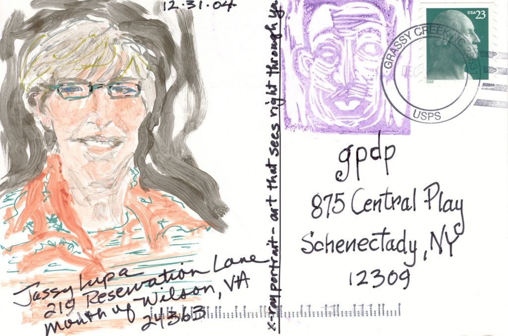
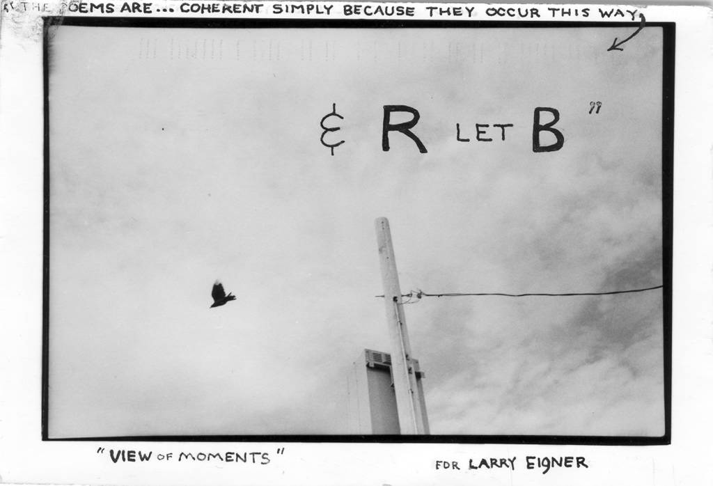
The last piece of mailart I received in 2004 came from Roy Arenella. This is not much of a surprise since the prolific Arenella is my most frequent correspondent and since this was his 520th mailart mailing of the year. We'll soon see if something from Roy is my first piece of mailart for the year.

This card is one of Roy's altered photographs, one in which he scratches a text onto the face of a photograph. It's a unique form of Arenellan visual writing. This piece Roy wrote for Larry Eigner, an American poet who wrote simple spare poems that spread out across the page in wisps of text. Strangely, until I read this card of Roy's, I had no idea that I have always imagined Eigner's poems written across the sky.


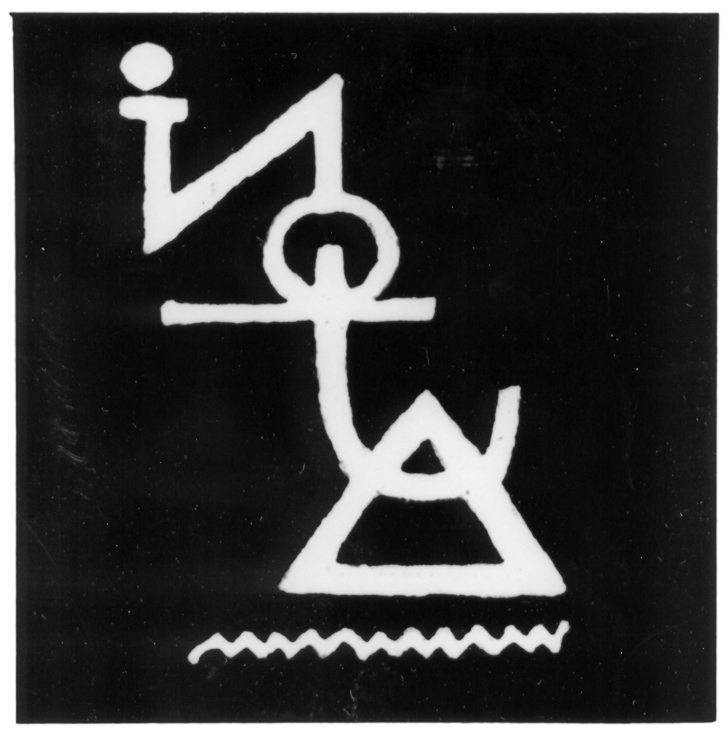
Roy Arenella, "View of Moments" (28 Dec 2004)

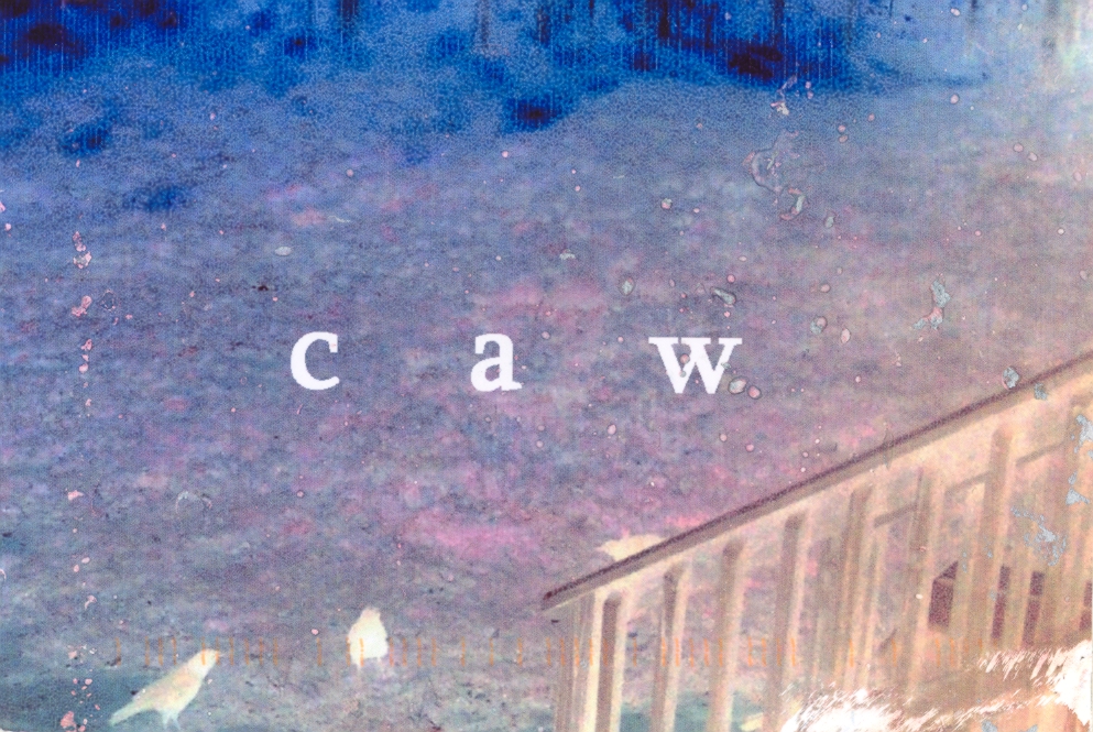
This photograph is quite simple: a sky almost entirely obscured by clouds, the black silhouette of a bird (a pigeon, I think) not plunging but flying across the sky but pointed downward, and a utility pole leaning leftward, its single line extending to the right and holding it in place. Atop this text, Roy has transcribed a (slightly modified) quotation from the poet Cid Corman (who died earlier this year in Japan).

I assume the quotation by Corman is about Eigner, but I can't be sure. If it is, it suggests that the apparently atomized language of Eigner's poems work because the arrangement of the words creates an unalterable and perfect field of text--a way of meaning a seemingly coherent paragraph cannot muster.

Since we have a bird flying on the obverse of this card, the two stamps applied to the reverse are a 10-cent commemorating the fiftieth anniversary of US arimail service and a 13-cent US Airmail stamp. Interestingly, Roy's pseudo-cancellation stamp inclues the rubberstamp of a man who is rowing a boat and using large wings as oars.

un violon d'ingres

A Thanks for a Thanks

Every year for the past eighteen, my family has created and mailed out homemade holiday cards under the rubric eXmaSscard. Although I consider these part of a long ongoing mailart project, I don't treat it as such and I rarely sends these out to mailart correspondents. I did send this year's card off to Roy Arenella and his wife Martine.

Roy enjoyed the card and send the following "maximal thanks" in return. Little need for that. Roy has filled my mailbox with beautiful tiny pieces of art for most of last year.


Roy Arenella, "For Deep Snow Deepened" (25 Dec 2004)

The "front" of this card, which holds the address, is decorated with a 13-cent Christmas stamp, a 2-cent red-headed woodpecker stamp, and a 22-cent public hospital stamp. This combination of stamps was required by Roy's need to use the Christmas stamp, illustrated with a mailbox filled with small packages, since he wrote this message on Christmas day. This card is numbered 517C.

un violon d'ingres

Ells Inversed on a Field Dapple

Ruud Janssen sends me another of his painted mailings. These are always wonderfully colorful and tactile, and I am thrilled whenever a real painting arrives in the mail from Ruud.

I probably should have included a copy of the reverse of this card (which gives us its number, 04-406), since Ruud has already posted the painting on his blog. Mailartists are still trying to figure out how blogging changes mailart.


Ruud Janssen, "04-406" (Dec 2004)

un violon d'ingres

A Mailart Christmas

Roy Arenella must have known that I was sending him a card this Christmas, because he foreshadowed my card with a card of his own. (I think his card arrived in the afternoon of the very day I mailed my card out to him in the morning.)

This is a great Arenella photograph. He's printed the photo with a little black around the edge of it, which intensifies the ranges of greys within. Nothing else is quite black, and very little is white. A rich variety of greys gives us this scene: a neck craned upwards to capture the figure of a woman holding a radiant dove and a clock. And it's remarkable that this is entrance to the post office in Forest Hills, New York. If you look closely, you can see delicate striations moving diagonally and downward across this photo: a pelting rain or a snowfall.


Roy Arenella, "Peace & Good Holidays" (17 Dec 2004)

Ruud Janssen claims this isn't a piece of mailart, which I find an interesting comment that says something about our expectations for art: how we expect art to be separate from our personal life. Me, I like my art mixed up with my personal life so that I can't tell one from the other, and that's one reason I enjoy Roy's work so much.

This card is decorated with a 20-cent Netherlands stamp (coincidentally where Ruud is from) and a contemporary 3-cent star stamp pasted down at an angle to mirror the falling star rubberstamping (carved by Roy?) that occupies the pseudo-cancellation stamp. I'm very happy to report that Roy (or the Fates themselves) saw fit to send me this particular card: number 500 p/c.

un violon d'ingres

Electronic Impulses from the Postcard

Mick Boyle's printer has been malfunctioning (or at least it was in the middle of December when he sent me this card), so he's converted his mailing to jpegs, which he emailed to me.

Thus we have emailart, but I find the method of Mick's mailings interesting given their content. These pieces arrived in my email in box as attachments, but they are mere avatars of their corporeal forms--forms they may never see. Think of it this way: Mick has designed this card to be printed and mailed; instead, it arrives as electronic copies of a hardcopy version that never existed. The electronic transmission is merely for convenience. Unlike, say, the kinetic e-postcards of Clemente Padin, these don't require electronic transmission.

Yet we are still left with beautiful typographical design by Mick Boyle. And the reader of the blog might never know these arrived electronically--except for my words here and the obviously false cancellation stamp on the card.


Mick Boyle, Sumo wrestler postcard (11 Dec 2004)


Mick Boyle, Back of sumo wrestler postcard (11 Dec 2004)

Visual TV Poem Boys

Responding to an earlier blog posting, Luc Fierens sent me a bounty of small publications, all of which I'll review later at dbqp.

As a Boy is a small book of verbo-visual collages, most of them built upon a foundation of dictionary entries.

Visual Poetry: Mail-Artproject is the catalog of a mailart show of visual poetry. It is filled with interesting work.


Luc Fierens, "Visual Poetry: Mail-artproject" (2002)


Full TV Poems is the book that began it all. Its cover image of a woman whose face is covered wtih a hyper-illustrated half-circle engendered a micro-discussion by me about the limits of the definition of visual poetry. (Luc includes in his mailing--in true mailar fashion--a few artists' reworkings of his image.) The book itself is filled with numerous collages examining the world of TV culture.

More later, at dbqp.

un violon d'ingres