In the mail today, a photocard from Roy Arenella (mailing # 329, dated 6 Aug 2004). It is a simple card: a photograph of his mother near Halloween of last year and a small note about his return from vacation. Roy’s mailings are more like regular correspondence than those of other mailartists. He always writes me a note. His photocards are designed as conveyances for small notes. I enjoy the literal correspondence in his correspondence art; I always love receiving mail.
Maybe I missed this transformation in an earlier mailing, but now my first name appears without a zero for the oh; instead two parentheses and a raised dot make up the third letter of my first name. I love this evolution of the form of the name, which is now something like “Ge(.)f.”
Shaker Mailart
Roy Arenella’s mailing # 331 from 7 Aug 2004 includes another note and a copy of a small color leaflet “4 Mail Art Markers,” which include four fairly diverse quotations, none of which directly mentions mailart. One of my favorites is this one from Wallace Berman:
Send me things in the mail. Wherever you go, I don’t care where you go, just send me something in the mail from where you are.
Inside the envelope is a small photocopy of a Ray Johnson bunnyhead wrapped around a quotation from Johnson himself: “I’ve spent my life compressing compressing compressing objects & information into small envelopes.”
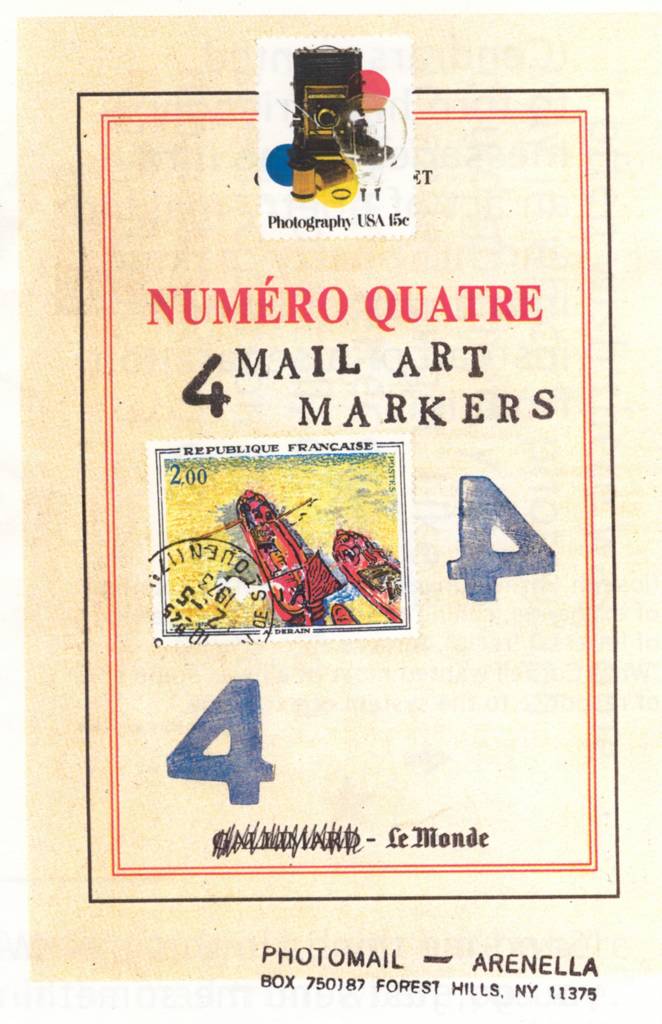
Roy Arenella, "4 Mail Art Markers" (2001)
Actually, this mailing includes an earlier note from 6 Aug 2004, which is illustrated with a wonderful Shaker gift drawing. Roy says of these drawings, “The stuff is great! & for my eye, more often relevant to the practive of visual writing than a lot of ‘avant garde’ work.”
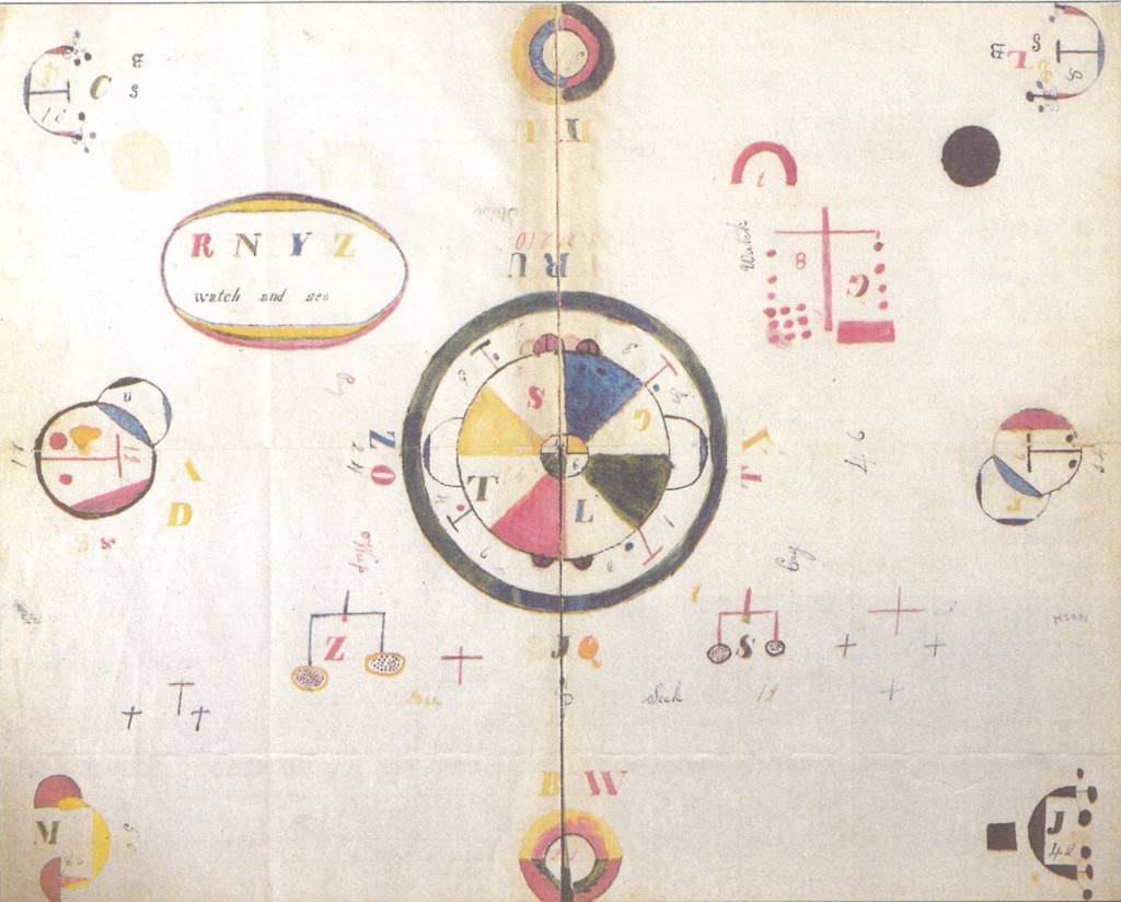
Shaker Gift Drawing
The copy I have from Roy of these Shaker drawings captivates me, yet I cannot quite make out what it is doing. The drawing posits a rule: that it will consist of a set of mirror-like balancings of its various parts. The rule holds for much of the drawing, but breaks down here and there. Letters decorate the field of the drawing, yet their significance is beyond me. I find it interesting, however, that Z balances with S, reminding us of Barthes’ S/Z. Muted colors abound. The letters appear in the common form of text on old broadsheets: They have dramatic thickenings of their shafts following by remarkably thin serifs and connecting lines.
I yearn for a collection of these drawings, for a book of them.
un violon d’ingres
No comments:
Post a Comment