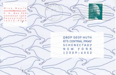
The first card is just another example of the fine typographic design created by Mick, who's certainly the most accomplished typographer I deal with. He has taken the blue outlines of a number of identical birds and fit them together in a pattern similar to those designed by M.C. Escher. But I also love the text: the red return address, the offsides tail of the Q in QBDP, and the inclusion of a Greek capital E in the chosen typeface.
I chose this side of the card (too lazy to do both as I try to catch up with mailart documentation) because I think the card may be presenting us bluejays, and therefore it echoes Roy Arenella's bluejaypost. But the "message" side, also presented in blue, is an interesting jigsaw of images: a tv-scan-lined images of a young man, a drawing of a pair of feet across the grain of a wood floor, a bound man with his mouth taped, and about a third of a naked man who is tattooed as "Joe" and whose left eye is barely visible to our own.

Mick Boyle, [escherbirdpatterning] (Oct 2004)
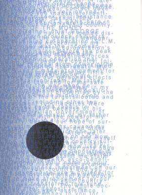
On the face of this card, Mick writes, "here is one way to deal with spam." And it is a beautiful solution to spam. I like how words suddenly jump out of the text announcing themselves before falling back into tumult.

Mick Boyle, [spamtextvisualization] (Oct 2004)
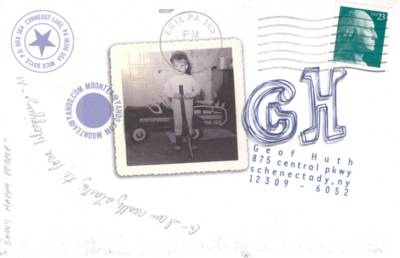
This old almost-deckle-edged snapshot is a beautiful composition, and the design I once again love. We miss, however, the "SHINY HAPPY PEOPLE" who are arguably the central subject of this card. On the reverse is a blurry close-up of three very pink and quite shiny men, who are smiling at something to the right of me.

Mick Boyle, [snapshotpostcard] (Oct 2004)
un violon d'ingres
No comments:
Post a Comment