Still Point, Garlock Road, Caroga Lake, New York
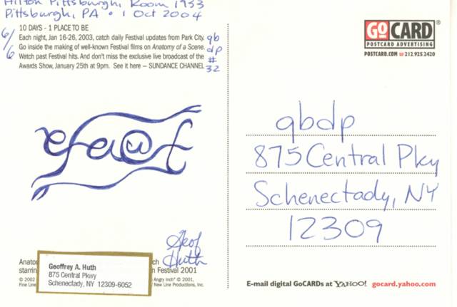
I've let this "responsibility" of my life (qbdp) slip a bit over the past couple of weeks. I didn't keep up with my process of recognizing my mailart correspondents, held back too much by sickness, travel, and preparation for travel. Worst of all, I didn't even release an "issue" of qbdp on two separate nights away from home over the past week. Last Sunday, I slept on a plane, taking a redeye back east from Los Angeles, so I didn't have the energy to create a set of cards while I was flying--and what would the other passengers have thought? And two days later, I was away from home again (in Elmsford, just outside of White Plains, New York), and I was so sick and busy that night (not getting into my hotel room until about 11:30) that I gave up the idea of producing an "issue."
In the next few days, I will add illustrations to my more recent entries below and I will return to a discussion of the mail I've received over the past couple of weeks. Catching up should be interesting.
Today, I made up for my laziness regarding qbdp's by producing the most complicated one yet, a small found card decorated with a fidgetglyph and other handwriting and stored within a handlettered envelope.
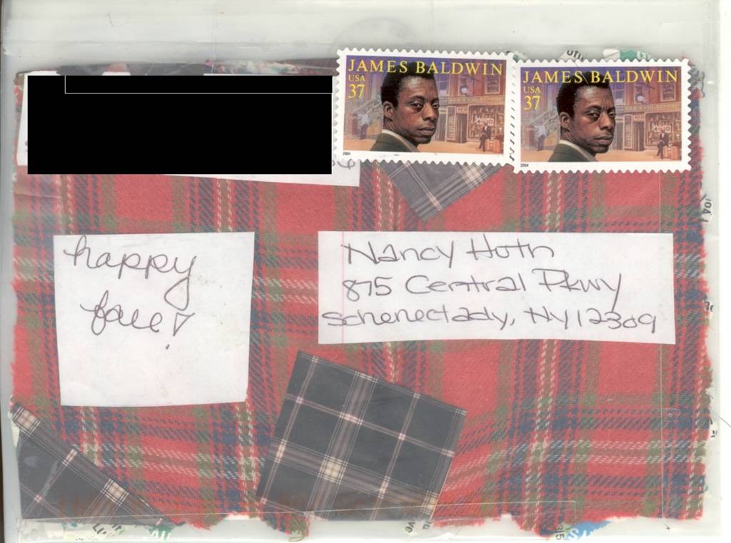
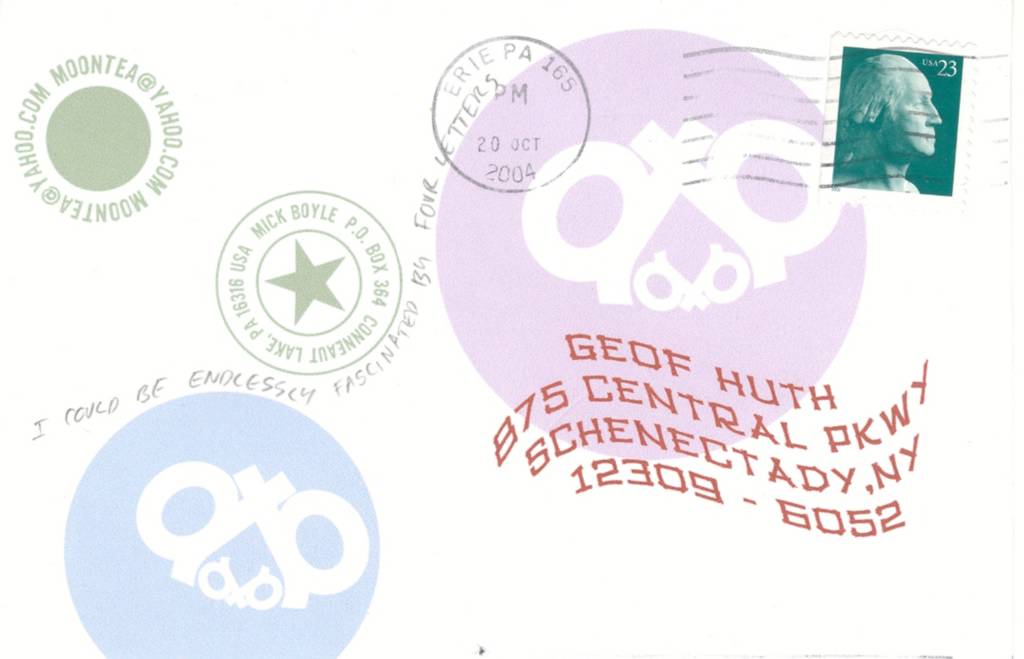
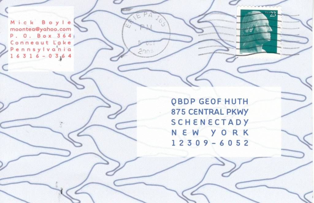
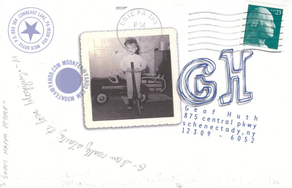
The carrier for this mailing is a grey invitation envelope with a bold address in black covering most of its front. The reverse includes two return addresses: My home address on the premlip, and a partial address for this camp I'm writing from just under the premlip.
Inside, there is a found card. I had sixteen of these, so I made sixteen mailings. The card is a grey laid card printed on one side: a vinelike decoration around the edge, a logo (a boy riding a giant grasshopper jumping over a giant H that protects a smaller H between its two legs) at the top of the page, and a simple message ("Holiday House / is coming to town"). I can no longer remember where I found these cards, but they are interesting.
Under this logo and message (or emblem and verse), I wrew a small fidgetglyph called "Danauzgy," which is a simple fidgetglyph about vision and the interpretation of what we see.
The "colophon" for this issue I wrote within the openings between the entwining tendrils of the edge decoration. This colophon includes the qbdp number, the date of creation, my name (as author), and the sequential number ("1/16," etc.). I also added "UT" between the two aitches under the grasshopper--thus spelling out my name. Finally, I colored the logo in red, green, brown, and blue.
Since this is a holiday card (apparently celebrating Columbus Day), I wrapped the card in a ribbon made of a cutting of
Berroco Mosaic FX yarn, which looks something like two lines of thread held together with a series of thick rungs.
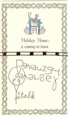
Geof Huth, "Danauzgy" (10 Oct 2004)
On the back of the card, I wrote a unique message to each of the recipients.
These are the lucky recipients of "Danauzgy" (qbdp # 34):
1. Ruth and Marvin Sackner
2. Robert Grumman
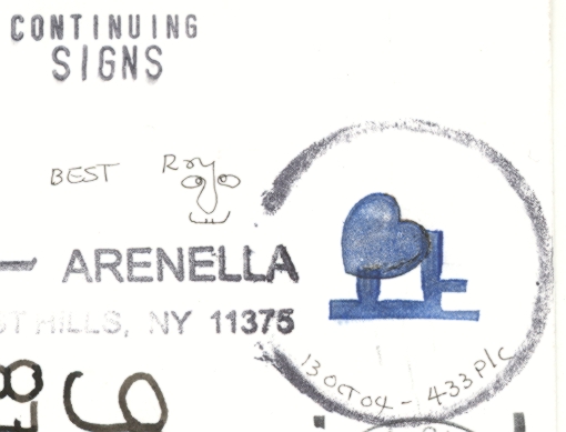
3. Roy Arenella
4. Mick Boyle
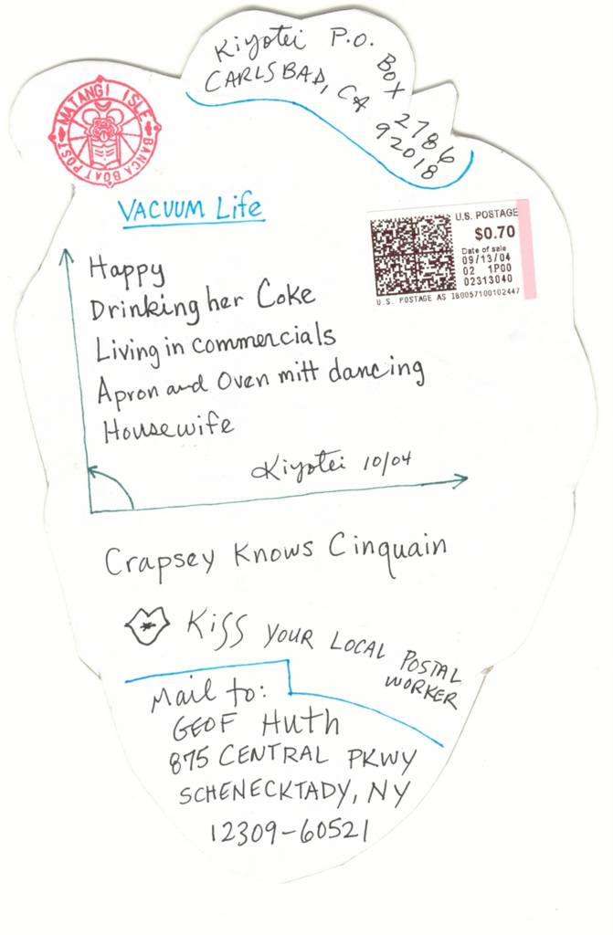
5. kiyotei
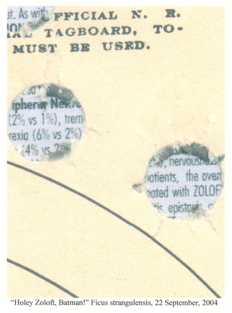
6. Ficus strangulensis
7. Scott McDonald
8. Ross Priddle
9. Reed Altemus
10. Luc Fierens
11. j0llyr0ger
12. endwar
13. Dees and Yuriko Stribling
14. Angelica Paez
15. Erin M. Huth
16. qbdp
un violon d'ingres