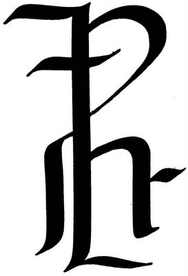
I've continued my experiments with my new steel brushes (a birthday gift) today. This time, I took a slightly different tactic. Rather than focusing on asemic or minimalist texts alone, I decided to focus on the parts of letters and rearrange them in single monogram-like text-clumps. What I discovered was that the parts of the printed letter are much different than the parts of the calligraphic letter, so this gave me an entirely different set of shapes to deal with. My favorites of these grams I called "The Monogram of Titus the Great," and I made thirteen copies of it on 13 identical found cards I had with me.

Geof Huth, "The Monogram of Titus the Great" (29 May 2005)
The recipients of "The Monogram of Titus the Great" (qbdp # 58) were as follows:
1/13 Ruth and Marvin Sackner
2/13 Bob Grumman
3/13 Roy Arenella
4/13 Ruud Janssen
5/13 Reed Altemus
6/13 Jassy Lupa
7/13 Scott Helmes
8/13 RF Côté
9/13 Erin Huth
10/13 frips
11/13 Jukka-Pekka Kervinen
12/13 Scott McDonald
13/13 qbdp
un violon d'ingres
2 comments:
but, haven't you forgotten someone?
Always, unfortunately.
Geof
Post a Comment